Summary
Rundle Blinds and Curtains is a strong local business in Adelaide that helps create beautiful homes through selling and installing high quality blinds, awnings, shades, shutters and home motorisation.
Our Roles
- Marketing Agency
- Brand Design
- Marketing Manager
- Brand Asset Implementation
Challenge
When sister stores, Burnside Blinds & Curtains and Rundle Blinds & Curtains, decided to operationally merge under the one business name, it was a great time to reconsider the business branding and messaging.
The newly combined businesses, Rundle Blinds & Curtains, wanted to impress an image of superlative service and quality product on to the consciousness of the Adelaide metro consumer market. The first very essential step, for portraying this narrative, was with the design of the business logo.


Insights
The business itself had a lot of love and support. They retain a significant percentage of clients over two decades with product lines that should last 5-20 years.
When speaking to customers, while they loved the business and the owners, they struggled to find ways to strongly advocate for others to use their service. While a lot of word of mouth was driven for the business, much of this was on a one-to-one basis.
Solution
Building a brand that sets the tone…
The importance of your logo
A logo is the first introduction of a company to a potential client. When you are looking to be a top-tier company within your industry, the quality of the logo design cannot be underestimated. If you get the logo right, the rest will follow far more smoothly.
This was especially important for Rundle Blinds and Curtains who have a large number of competitors all saying very similar things. As part of our workshop with the key business leaders, we identified the key messages we wanted people to say about the business and developed a clear messaging plan to do this. Then we focused on how to bring those ideas to life in the design style of the logo and branding.
Logo Considerations
A logo needs to be transferable across many mediums (i.e. from print to digital), be resizable (i.e. from the shopfront to the business card) and also work across all art forms.
With their business using over 30 different mediums, formats and displays for their brand, our initial concepts took into account the versatility of colours and styles needed for the branding. We also took the opportunity to try and cull some of the formats to make it simpler for anyone to use the branding in the future (and save on needless design costs).
One of the designs that resonated with all of us was a gold trim feel and a simple design box for the letter R as a trademark stamp that could be used across multiple items.
As part of the process, we ensured that all designs did not infringe any logo or design copyright. We also tested various shades of the gold on different printed surfaces to make sure that the promise of the colour was able to be reprinted in the right way to reflect the premiumness of the brand. This is an often overlooked part of the branding we see other businesses fail to understand and implement.
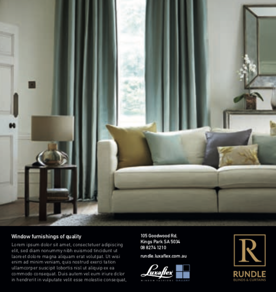
Consistency of colours is a significant factor when it comes to printing, whether it be for a magazine, a business card or a sign. The canvas itself can impact the output of the colour components of your logo and so these factors all need to be duly appraised at the outset. For example, for the new business cards and partnership brochures, we used a soft touch velvet finish paper that has a higher absorbency, so a foil is the ideal solution for the logo here, with a coated UV finish.
The logo colour scheme should be clearly defined in each of the industry standard colour coding systems within your logo guidelines. This makes it simple to brief contractors employed for any design work going forward, so that you have a visually consistent brand across all of your platforms.
In the case of Rundle Blinds & Curtains, gold foil was also incorporated into the logo, which adds additional printing considerations that are important to get right. The use of gold adds another level of complexity, but it is well worth the extra effort in order to realise a high-end and elegant logo for the business. The next step, for the digital age, is creating an animated version of the logo.
Finally, we delivered a simple brand guidelines document that has helped others use the new branding in a consistent way across the business.
![]()
![]()
Using a tagline
An accompaniment to the logo, a tagline sets the tone of the business and reinforces a company’s mission and the products or services it offers.
In the case of Rundle Blinds & Curtains, Adelaide’s Premier Window Furnishings Company clearly communicates the type of products and the quality you can expect from the business. The tagline helps set Rundle Blinds & Curtains apart from their competitors, indicates the personality of the business and allows the consumer a quick assessment of what they can expect from the company.
Be careful though – lofty aspirational statements can be detrimental to your brand if you clearly are not living up to the expectations of your tagline. Ensure you have your internal processes in order, including smooth running systems and a professional team, to support your company ambitions and to protect your reputation. After four years already working with Rundle as their marketing partner, we knew that the promise of the brand would be kept by the service that they deliver.
Updating all your platforms
With the creation of the new logo and tagline comes the updating of all your platforms, advertising and marketing materials. This is an important task and covered many different touchpoints, including:
- In-store materials (such as business cards, store displays and order/invoice books)
- Staff uniforms and materials
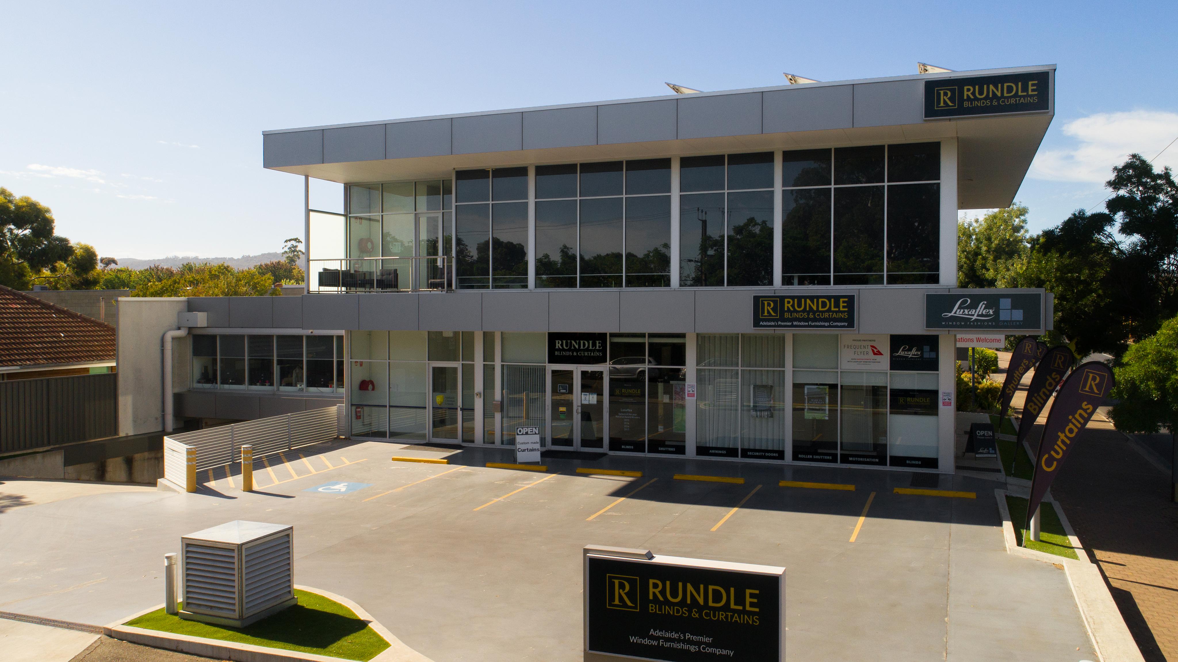
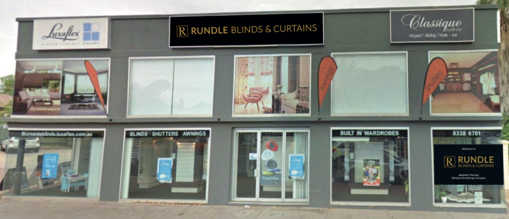
- Window, building and car signage
- Printed Materials (like brochures, letterheads, catalogues)
- Product stickers, warranties and documentation
We worked to ensure a consistent look and description across all their digital platforms including website, social media accounts, email signatures, automated emails & newsletters, Google My Business pages, applications, digital PDFs, software and any internet business directories.
Finally, we worked with all the network of partners they’ve built a relationship with, including other businesses, suppliers or distributors, to update them with the appropriate files for their relevant software, materials and systems.
Results
The feedback about the new branding was resoundingly positive from the Rundle Blinds & Curtains community, with all in accord about the success of the new look logo and tagline. The rebrand is a great foundational marketing mechanism for the company, representing a business that supplies quality products and has a hardworking team that delivers great service and is backed by efficient systems.
Continued consistent strategic and brand appropriate marketing, that supports the business mission of being Adelaide’s premier window fashions company, has galvanised the newly merged Rundle Blinds & Curtains dominance in the Adelaide metro market. The proof is in the pudding and happy clients leave great reviews, providing social proof to other potential clients. The business is thriving even in the most challenging of economic circumstances.
